To Begin
Skills: Typography, Editorial Layout, Illustration, Motion Graphics
Tools: Indesign, Procreate, Illustrator, Photoshop
Scope: August 2023
Project Brief
The project's primary objective was the development of an integrated promotional campaign for a typeface family. This encompassed the creation of both a printed booklet and a screen-based animation. My task was to establish a coherent visual language while defining distinct roles for each design format. The key was to employ a refined hierarchy to effectively highlight the nuances of the typeface family.
My Take
Originally, I had planned to take a magazine design approach to emphasize the sophistication of Majesti. My inspiration drew from the aesthetics of high-end fashion and lifestyle magazines, aiming to blend the versatility of Majesti with the refined look of upscale publications.
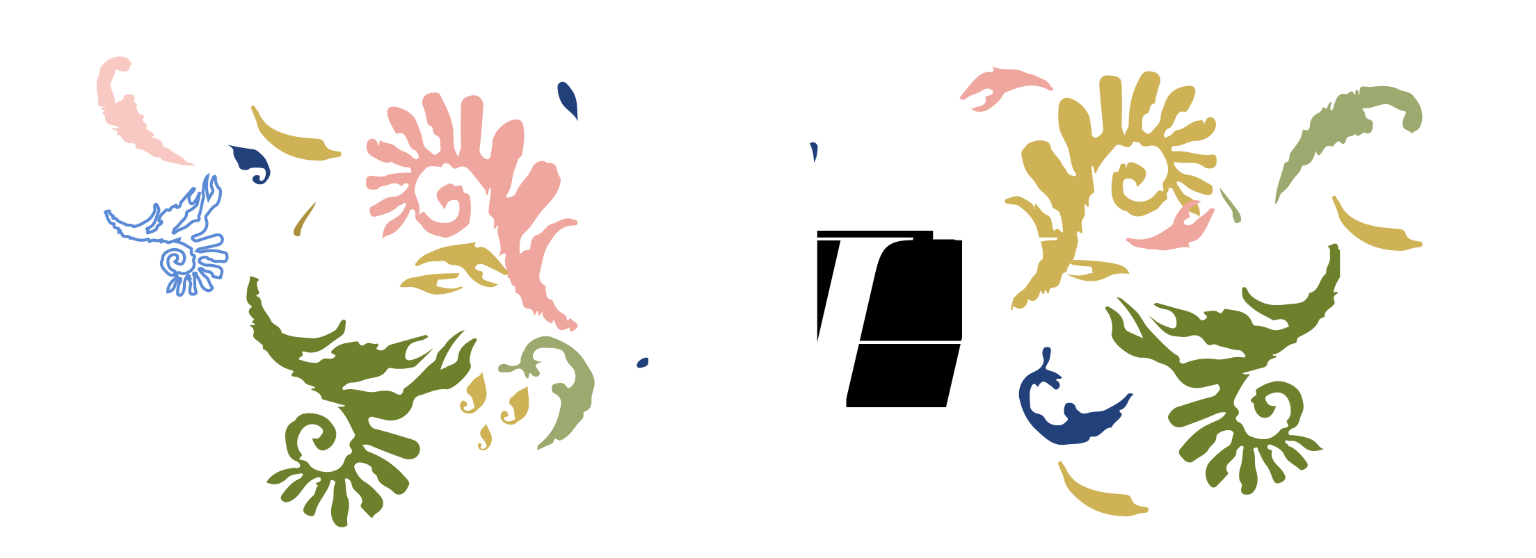
However, as I continued working on the booklet, I opted for a slightly different direction. I decided to pursue a softer, more 'natural' appearance. I drew inspiration from floral elements and greenery to infuse a sense of nature into the design. The inclusion of illustrations not only accentuates the attributes of the typeface but also allows for a continuous sense of motion and naturalness while preserving the elegance found in Majesti Banner. This also helped to incorporate a humanistic touch to the booklet design.
Although Majesti Banner is often associated with elegance and regality, I wanted to demonstrate the lyrical and illustrative qualities of the typeface.


